Brand Refresh Project
Today we launch our updated brand look, including an update to our logo. This blog aims to explain why we decided to embark on the brand refresh project and how we came to the decisions made on the logo.
Firstly, we loved the original arbnco logo. It’s clean, modern, and simple. That said, in the last few years, arbnco has had a period of sustained growth and several strategic adaptions in structure and products. Therefore, we thought it was only natural that our brand and logo represented these updates.
An important element of branding is recognition, when people see your logo it should be instantly recognizable and consistent.
According to the brand survey we conducted, internally and externally, things were becoming slightly confusing and we decided it was time for a refresh.
Research
We researched the competitive landscape, analyzing visual identity and presence. We studied the theory of architecture in branding and read through past examples and case studies. Goals and objectives were identified and then the design work was approached with strategy and purpose.

Design
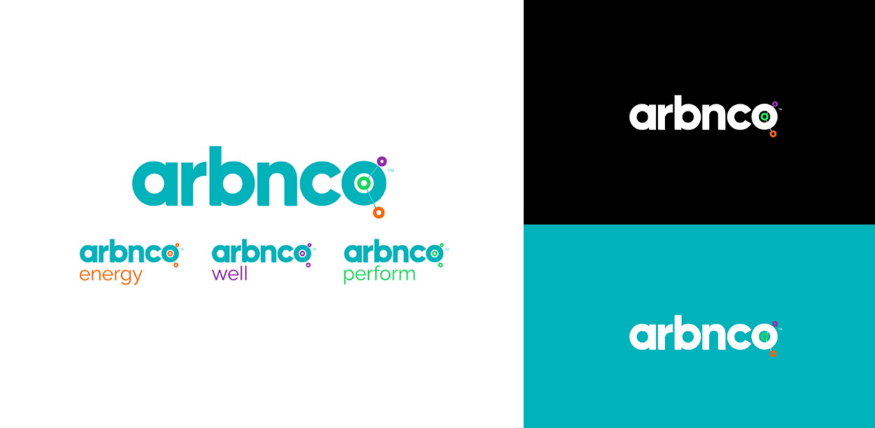
The main jobs we wanted the logo to do were to improve recognition and brand awareness as well as clarify the structure of the product suite. The results are below.
The logo looks a little different but still has the character of the original. It’s now clear that our focus is on data, the icon at the end of the word arbnco illustrates this. The 3 colours used in the parent logo create a sense of unity throughout our main product suite: arbnco energy, arbnco well and arbnco perform. The sub brand logos have been simplified but look reassuringly similar to the parent logo which will now improve brand recognition.


Conclusion
We are so excited to share this update with you but most importantly, we want to reassure everyone that we are still arbnco – clean, modern and simple, but now more consistent and recognizable.